Tuesday, April 19, 2011

C.A.P Section 3


Clarity
Are the literal, stylistic and thematic messages of this piece clearly and efficiently presented?
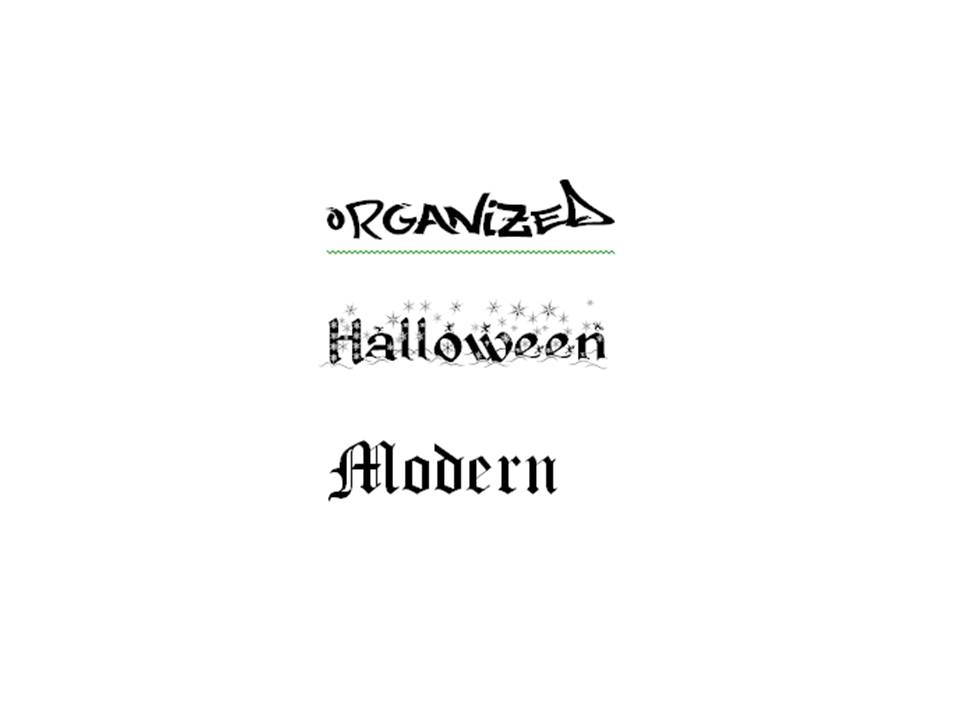
Each part of this piece is trying to convey the meaning of one word. I thing each section accurately conveys the meaning of that particular word.

Is each working toward the same overall message and goal?
Each image is working toward conveying the meaning of the word. All of the text is explain what I was thinking and what I was trying to accomplish for each image.

Is there any possibility of misinterpretation of the piece’s message?
There is always a possibility of misinterpretation. This is why I included text explaining what I was trying to do and what I was thinking. Since this is not complex I do not think anyone would misinterpret the message.

Is there more than one message fighting for attention here?
No, Each image is conveying the message of one word. Each section of text is explaining one image.

Could the concept, message, or theme be simplified for the sake of impact?
No, I think that everything is already at its simplest point.

Audience
Who is the target viewer of the piece?
The target viewer of this piece is the professor. Also the students in the class can view this piece. I also think I am a viewer of this piece.  Since we have to write a reflection about each image I look critically and describe everything that I have done. This helps me to realize what I have done well and what I need to work on doing better in the future.

Who does the client think their primary audience will be?
Since this is a project for school there is no client.

What are the visual tastes of the demographic segment?
When I turned in the blog for the last assignment it was all black with white text. The professor did not really like that so I tried to make a lighter background color with black text. So the visual taste is not dart colors.

What can you do to be sure of your conclusions?
I do not think there is anything I can do to be completely sure. I do not think anyone can ever be completely sure of something that is subjective. Some people will like certain things and others will not. All I can do is try to learn as much from the book and put forth my best effort. Then make change and learn from feedback.

What tone should the concept have if it is to be well received by the audience?
Since this is for a class I think and informative and descriptive tone will be well received by the audience. Also being aware and willing to learn from mistakes and successes will also be well received by the audience.

What sort of lingo might they respond to?
Terminology that is in the Design Basic Index, specifically the list of terms on blackboard.

Does the concept behind this piece talk down to the target audience?
No. The text is purely descriptive of what I have done.

Might it fly over their heads?
No, the professor is way smarter than I am and I do not think anything on this subject would be over her head. The other students in the class have heard the same lectures and read the same book.

Does this design stand apart from what this audience has already seen?
No, the audience had been working on the same exercise as I have.

If this piece were a person, what would she/ he look like and how would they behave?
What would the target audience think of this person?

Purpose
What exactly is this piece supposed to do?
Use images to show depictions of different word and alter the words to convey meaning using different techniques learned over the course of the semester.

Is it meant to sell a product?
No.

Is the purpose to inform or persuade?
The purpose is to inform both the audience and myself. It also has a secondary purpose to persuade the professor who is grading the assignment that I have learned the material over the course of the semester so I hopefully get a good grade.
If so, by what means?
It informs by demonstrating different techniques learned in the course. I persuades by showing off what I have learned. If this fails to inform it also fails to persuade and I will get a failing grade on the assignment.

Have you discussed the purpose with your client or art director?
Yes. I have showed the different parts to the professor and gotten feedback on how to make it better.

Has the purpose of this piece been adequately narrowed so that it can be given as much attention and power as possible?
Yes. Each image and text is on one specific topic.


Monday, April 18, 2011

Typographical Conveyance

For this activity we were supposed to use what we have learned this semester to reflect the meaning of the words. The words we had to display meaning for are: Shred, lightly, atom, brick, pillow, and XXL.


For this image I wrote the word shred in Photoshop then took the eraser tool and drew lines threw it to look like it had been shredded. I chose to make the lines thin so you could still read the word.


This image is supposed to depict the word lightly. I wrote the word in a handwritten font and then connected it to two prongs. This is supposed to look like a light bulb and the word is the filament. 

 For this image I wrote the word atom and found an image of an atom and substituted it for the o.


For this image I wrote the word brick in all caps in a font that looked like a box. I changed the text to an orange ish color so the text would look like a brick. I then stacked the words so it would look like a brick wall. I put an off white background so it would look like mortar.

 
For this image I found a font that was really large and kind of resembled a pillow. I then wrote the word pillow in a white color and put a blue background. I put the word at the top of the image so it would almost resemble a pillow on a bed with a blue comforter.


For this image I wrote XXL in a really large font. I also chose a font that was bold and boxy to make it look even larger.

Second Life Prims

This activity was to create a prim in second life.


I created a sphere in Second Life and place a picture on the sphere. I wanted to put a picture of the earth on the sphere so it would look like a globe but I could not figure out how to do that. You can see the picture I chose in the upper left hand corner. The image on the sphere was upside down.


Since the first picture was upside down I tried a different image and figured out how to change the rotation and make it so it was no longer upside down.

C.A.P. Section 2


Connotation
Does the visual style of this component tie in with the theme it ought to convey?
Everything in this blog is about the activities from the Design Basic Index textbook. I do not think there is really a theme to the overall style of this blog. Just different activities that highlight different techniques related to graphic design. And writing about what I did in each exercise.

Is every sub-component within the element working toward the same thematic goal?
Yes, Every part of this blog is explaining what I did for each activity. There might be a few places where I went on a little bit of a tangent but everything is about the activities.

Is its theme projected in a way that could be seen as to specific or overly broad?
I think this is more on the broad side rather than too overly specific. I tried to highlight what I did and what I was thinking in each section. I did not explain specifics. If I had to go back I would try to expand on each section to make it a little bit more detailed.

Could color, proportion, quality of finish or font choices within this graphic element be adjusted to better reflect its message?
I think things can always be adjusted and changed. Since we turned in the blog last time I tried to change some of the blog colors to make it look better. I changed it from all black to blue and grey. I still think it would look better with some lighter colors. If I get time I will change this before turning in. I think I cold also spend some time on each section making sure the quality of each is well done. There is unequal spacing between the images, some typos, and some things that are not explained well enough.

Would it be helpful to show the logo or compositional element to others to find out if they perceived it the same way as you?
Yes I think it would be important to see how other people perceive it. I think people tend to perceive different things differently. Especially if you are working on something, you may become biased. Either being overly critical or think it is awesome when it is not.

Attributes
Are you satisfied with the visual weight, structure, color, and presentational style of the logo or graphic element?
I think I could have done a better job with this. I think I could have done better with the structure. I did not add everything to the blog as we went along. I could not remember which parts we did when. So nothing is in chronological order. I was also looking at the activity sheet so I missed a few and had to go back and add them.

Could line work be thickened, made thinner or “roughed up” in order to better establish the element’s aesthetic and thematic integrity?
I think the lines around the images are too thick. If these were thinner I think it would look better. I do not think the “rough up” look would look very good on this blog. I wanted to go for the more clean, sleek, and organized look.

Is this graphic or typographic element associated with a backdrop?
No, the typography is not associated with the backdrop.

Have color options for each component been explored?
Yes, I have changed the colors since the last time I turned in the blog. I think the new color options make the blog seem neater and make the text easier to read.

Will the color scheme of each element fit in well with the scheme of the larger layout in which they are placed?
The color scheme of each blog post is the same as the overall layout. Each individual image is not the same color scheme as the overall layout but I do not think this would look very good if it was.

Is the element intended for broad use (i.e. logo)? If so, as it been designed in such a way that it can be presented in a wide variety of sizes and displayed in various sorts of media? Is the typography appropriately legible?
The is not designed for a broad use, just for the computer that has access to the internet. Blogger will scale to fit a variety of different size computer screens. For example my laptop computer screen is small and I can read everything fine. The commuters we use in classroom have a lot bigger screens and it still maintains good quality. Since this is on the internet someone with an internet compatible phone could access the blog and everything might be a little bit small. But the smartphones with internet access are designed to be able to zoom in so they would still be able to read it.

Is the text large enough for the intended audience to easily read?
Yes. The intended audience are the members of the class and the professor. Everyone in the intended audience is young and should be able to easily read the font. If there were senior citizens in my intended audience I would have made the font size larger.

Does the look and feel of the type connect with the overall message?
Yes. I used a san serif  font and it displays the neat and professional feel that I am trying to go for.

Is it time to look for new fonts?
I think different fonts could make this a little easier to read. But, I have not extensively studied fonts so I do not know what ones would be better. I have heard that san serif fonts are better for on screen reading and that is what I have. There is not that much text and I do not thing changing fonts would make a whole lot of difference. If I had a hand written font or an old English font then changing font would make a big difference.

Placement
Should this component be given a starring or supporting role within the layout?
In the blog all of the titles are in larger font and bolded to show that it is in the starring role. The text is left aligned with the images centered. All of the text that is supporting or describing the image is located beneath the image. At the very top of the post under the title there is a sentence describing what each activity is. This serves as an advanced organizer indicating to the reader what the objective of each post is.

Should it call attention to itself or go virtually unnoticed?
I think everything in the blog is important and nothing should go unnoticed. At the same time I did not want one thing to draw to much attention and take the interest from other parts.

What sort of placement should this graphic element be given within the composition?
All of the images in the blog are centered with the text describing it right underneath. This is done uniformly through the blog so the reader knows what text corresponds to what image and it is not a puzzle to figure out what image the text is describing.

Should its edges align with other elements within the layout?
I do not think the edges of the images should align with the edges of the text. I think it looks better with all of the images centered and the text left aligned. We are used to reading books and magazines with left aligned text.

If so, will it conform to the same alignment conventions that apply to other elements in the composition (flush left, flush right, centered, etc.)?
Every post in the blog conforms to the same alignment. All of the text is left aligned and all of the images are centered.

Should this element be visually grouped with others for conceptual and aesthetic gains?
I do not think all of the elements should be grouped together. I think it is better to have the images with the words in between them than to have all of the images grouped together at the top and all of the text grouped together at the bottom or vice versa.

Once placed within a layout, should the element be further cropped, rotated, moved, sized or altered in any way?
I think it would look better if all of the images were the same size. Some of the images are larger than other images but I did not know how to change this.

Tuesday, April 12, 2011

Emotional Design

Sometimes I feel that homework is never ending. There is always something is should be doing and whenever I finish something there is something else I need to do. I feel like there is always a project that I need to do, a paper I need to write, or several textbooks that I have not yet read. For this emotional design activity I wanted to reflect on the enormous load of work that is always present.


I started off with my design basics book. This book is not really that difficult to read I just used it because I was for this class. I tried to take a picture from a perspective what would make this book look really big. So I put the camera next to it so it would look like the book was going off into the distance.


I removed the original background and replaced it with a white background so it looked like the book was going toward vast open space. Then I added the title of "Why is Homework Such a Daunting Task?"


I then found a picture of stars and thought that this would convey a better image of not ending and openness than a white background.


This was my next draft. I put the stars in the background, changed the text, and made the text look like the credits from a star-wars movie.


I then made the book spiral almost as if it was being sucked into a black hole way off in the distance. Which I do sometimes feel that homework sucks me in and keeps me from doing other things.

Activity 13/ Combining Fonts and Images

For this activity we were supposed to create a log for a pretend company using a simple image.

I decided to make my pretend company a construction company. I called it "Quality Construction." I started designing my log by first selecting a simple image. I chose to use a screw so I searched screws using Google images and found these. I use Photoshop to select only the one on the far right.


I then added the font and placed the image in the logo. It looked like this. 


I used a blue font because I thought it went well with the gray color of the screw. I chose this font because I though it looked sophisticated and would help give off the Quality vibe. I chose to add a slogan because a lot of companies have a little slogan. My slogan was we can screw things up. I thought this was a humorous play on words with the screw in the log. Screwing thing up is often negatively associated. But if something is falling down and you literally screw it up so it dose not fall it can be a good thing. I felt that if someone saw this logo the would read the slogan laugh and remember it. The slogan is also in a gray color which is similar to the screw to the whole logo only has two colors.

Since I didn't really change the picture of the screw in Photoshop I redesigned the logo with an image of a screw that I drew. I don't think it looks very good and I like the other one better. But this is all original and not infringing on copyright laws. Which would be good if someone was using this for a real company.

Activity 12/ Word Portraits

For this activity we were supposed to find a font that supports the word that we used. Then we were supposed to find a font that goes against the word we used.


 The first three words are supported by the font. The first word that I wrote was Wild West. I downloaded a western font form dafont.com because it made me think of a font that would be on a poster for a wild west show. The second word is History. I used an Old English font found in word because I think this might have been how historical books might have looked prior to the printing press. The last word that is supported by the font is Newspaper. I downloaded a typewriter font from dafont.com. For some reason I always associate typewriters with newspapers. I guess I have watched to many movies where journalist are writing newspaper articles with a typewriter.


The second set of words are not supported by the font. The first word is Handwritten. I used Garamond font from Word because in a couple of my classes the professors want the papers typed in Garamond 11pt font single spaced. To me this font is associated with the computer not handwriting. The second word is Organized. I downloaded a graffiti font from dafont.com. I think grafatti is often more associated with chaos or vandalism than organization. The third word is Halloween. I downloaded a holiday font with snow and snowflakes because that is associated with Christmas not Halloween. The last word I wrote is Modern. I used an Old English font because that is more associated with history or antiques. I also thought it would be neat to use the same font in both categories.

In this activity I download several fonts from an outside website because I thought it would be interesting to break out of the confines of the fonts provided by Microsoft Word. I still used at least one font from Word in each category. But I felt that the fonts in Word were more for writing papers than for design.

Sunday, April 10, 2011

Color Echo/ Activity 11

In this activity we were supposed to find a digital image then create a background and add text that were composed of colors found in the original image.


This was the original image that I started with. I took this image and removed the background so there was only the redskins helmet.


This was my first attempt at color echo. The off white background was from the white circle next to the picture of the Indian. The burgundy color of the font was from the helmet. I then tried to create a more intricate background like the example in the book.


I used the paint tool to draw alternating stripes. The burgundy color was from the helmet and the yellow color was from the yellow tip of the feather. Some of the stripes were not completely straight evenly spaced or lined up where they went behind the helmet.


Here the lines are perfect straight and where they go behind the helmet they come out at exactly the right place because I put the stripes on a different layer. I had some problems with the text at first because one of the stripes was the same color as the text and I had to go back and add space between the strip and the text. Some of the stripes are at different angles and do not have uniform space between them. I think since the lines are perfectly straight this makes the gaps and different angles look worse. I like the one with the and drawn lines better. I also like the space between the line and the helmet rather than just the helmet laid over top of the lines.


During this class period we also discussed hue and saturation. I added some images discussing the change in hue and saturation.


This was the original image that I started with.


The first thing I did was to set the hue to -30. This added more blue than the original image contained. The purple places in the ocean turned to dark blue and the red places on the mountains turned more pink.
Most of the green areas on land turned yellow. But, there was still some green places left.


I change the hue again and this time the image looked completely different. None of the colors were in the same area as they were in the original image. The ocean is now green and yellow and the land is light blue, dark blue, purple, and red. Next I put the hue back to the default settings and played around with the saturation.


This is the original image with a little change in the saturation. All of the colors are the same but they are more dull.


Here I set the saturation all of the way down and there are no colors left. Everything is in a gray scale.

Text Safe Areas/ Activity 10

For this activity we were supposed to create text safe areas over a background.


I continued with the brick themed background from activity 9. Here I created a solid white text safe area (0% opacity) with black text. The black text with a white background creates a bigger contrast and is easier to read.


This image is the same as the previous one but, I changed the opacity of the text safe area (25%). I think this text box is more visually appealing and it still maintains the contrast between the color of the text and the color of the text box safe area.


This image is similar to the previous one I just changed the opacity to 50%. This makes it so you can see more of the background through the text safe area. But, at 50% opacity the text safe area still maintains enough contrast from the text that it is still easy to read.


This image the opacity of the safe text area is set to 75%. This makes it easier to see the background behind the safe text area. But, the more opaque text safe area reduces the contrast between the text making it more difficult to read the text. I used a text that can be used on top of the brick without using a safe text area but if this text could not be read without a safe text area it would really difficult to read with the opacity set at 75%.


Here I used a black background with black text and a white safe text area at 75% opacity. Since you can see through the safe text area to the background there is not a lot of contrast between the text and the background making it more difficult to read.


I used the same background but set the save text area to 50% opacity and it is much easier to read. Pending on the text color and the background the safe text area will have to be set to different opacity to increase readability.


I decided to play around and create a safe text area that was not white whit text that was not black. I think this is easy to read but not very visually appealing. With a different background and different colors I think a colored safe text area can almost be incorporated into the design creating something that is more visually appealing than the original.


On page 189, there was a picture of a safe text area that did not have a solid straight edge. I tried to replicate this and created a safe text area then added glow, and changed the size and transparency until it was close to what I wanted. I think this is more visually appealing than just a rectangle safe text area that is used in the other images.

Saturday, April 9, 2011

Legibility/ Activity 9

For this activity we were supposed to find a background and place text over it and make sure it was legible.


Here I used a brick background with white text. I thought the white text would have good contrast with the darker color bricks and keep a two color theme. The text did not stand out as much as I wanted it to. Even though there was contrast between the brownish red brick and the white text, there was not enough contrast between the color of the mortar joints and the color of the text.


Here I used the same background and the same font. I made the font color black and I also made the font bold. This black color create more contrast making the text stand out more. Making the text bold also helped for it to stand out more.


Here I decided to play around with more different backgrounds and text. I placed white text over the darker black background. Since there were not very many white stars in that area it did not effect the contrast like it did on the brick background with white text.


Here I wanted to experiment with another background. I made the text at an angle because sometimes when wood is stamped it is not always straight. Also every example in the book and the ones that I have done had the text straight so I decided to have some fun an make the text at an angle. The black text contrasted with the wood so it was easy to read the text.

Icons/ Activity 8

Activity 8 was to find an image and create an icon of that image using basic shapes and colors.

The image on the left is a picture of a screwdriver I found on the internet. The image to the right is the icon that I created using PowerPoint. For this icon I used a wide rectangle for the handle an oval for the top. A long skinny rectangle for that connected the tip to the handle. I then used three skinny red rectangles so the Icon would have the same red stripes that the image of the craftsman screwdriver did. I made the stripe in the middle a little bit longer so it would make the icon look more cylindrical.

 I created another version of an icon using Microsoft Paint. I used the same simple rectangles and circles as I did in PowerPoint but I then used some of the editing tools in paint to try and enhance the image. Created a blue square then used the eraser to create the concave part of the handle like it was in the original image. I also used the pencil tool to draw the tip of the screwdriver gut that did not come out very well.  

I still did not think I was doing a very good job on the icon so I found an example of a screwdriver icon on the internet and tried to recreate it.

I recreated this image using the combination of PowerPoint and Paint. I used a oval for the handle a rectangle for the shaft and a wedge for the tip of the screwdriver. I then put it together so it looked somewhat like a screwdriver and then copied it into Paint. I used the eraser tool to remove the lines so it would look like one image and not a combination of shapes. I also used the pencil tool to make a smooth transition form the wedge to the rest of the screwdriver.

Gestalt Principles/ Activity 7

In class we talked about the four Gestalt Principles: Closure, Proximity, Similarity, and Continuity. Created images that represents each of the four Gestalt Principles.
The first Gestalt principle I crated a visual for is Closure. We see images and attach meaning to them. If there an image but it is not quite complete our brain will connect the lines completing the image that we have perceived. I created an image to show this. I used two "L" shaped blocks and rotated them so they are almost touching but there is an open space in the middle. The open space is in the shape of a square but not all of the sides are connected. Our brain will connect the lines so when we look at the image we see a square. 

The second Gestalt Principle we discussed in class was Proximity. We group things that are physically close to one another in meaning full ways. In the image that I created there are two groups of 9 of the same size circles arranged in three column by three row square. We would associate the second square as being larger because there is a greater proximity between the circles.

The third Gestalt principle is similarity. Simularity is when we group like objects together. To repersent this I had two groups of 9 circles one group had small circles and the other group has large circles.

The fourth Gestalt principle is continuity. Continuity is when we look for unity in objects. To depict this I had an rectangle with an arrow going through it. In our mind we assume that even though we cant see the arrow behind the rectangle it is still there going in a straight line.