Tuesday, April 12, 2011

Activity 13/ Combining Fonts and Images

For this activity we were supposed to create a log for a pretend company using a simple image.

I decided to make my pretend company a construction company. I called it "Quality Construction." I started designing my log by first selecting a simple image. I chose to use a screw so I searched screws using Google images and found these. I use Photoshop to select only the one on the far right.


I then added the font and placed the image in the logo. It looked like this. 


I used a blue font because I thought it went well with the gray color of the screw. I chose this font because I though it looked sophisticated and would help give off the Quality vibe. I chose to add a slogan because a lot of companies have a little slogan. My slogan was we can screw things up. I thought this was a humorous play on words with the screw in the log. Screwing thing up is often negatively associated. But if something is falling down and you literally screw it up so it dose not fall it can be a good thing. I felt that if someone saw this logo the would read the slogan laugh and remember it. The slogan is also in a gray color which is similar to the screw to the whole logo only has two colors.

Since I didn't really change the picture of the screw in Photoshop I redesigned the logo with an image of a screw that I drew. I don't think it looks very good and I like the other one better. But this is all original and not infringing on copyright laws. Which would be good if someone was using this for a real company.

Activity 12/ Word Portraits

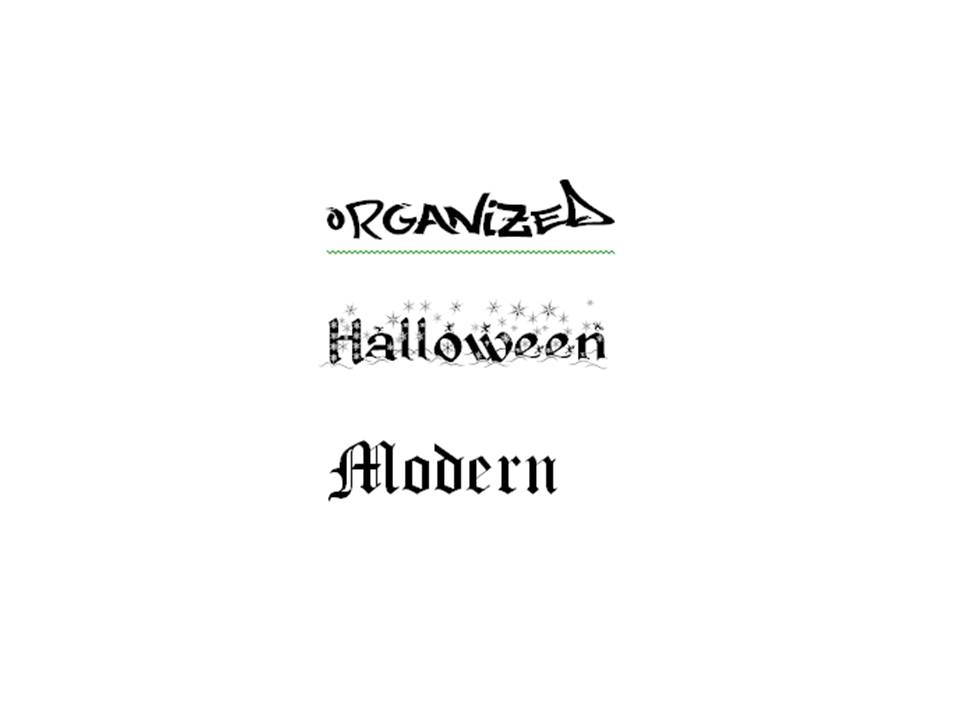
For this activity we were supposed to find a font that supports the word that we used. Then we were supposed to find a font that goes against the word we used.


 The first three words are supported by the font. The first word that I wrote was Wild West. I downloaded a western font form dafont.com because it made me think of a font that would be on a poster for a wild west show. The second word is History. I used an Old English font found in word because I think this might have been how historical books might have looked prior to the printing press. The last word that is supported by the font is Newspaper. I downloaded a typewriter font from dafont.com. For some reason I always associate typewriters with newspapers. I guess I have watched to many movies where journalist are writing newspaper articles with a typewriter.


The second set of words are not supported by the font. The first word is Handwritten. I used Garamond font from Word because in a couple of my classes the professors want the papers typed in Garamond 11pt font single spaced. To me this font is associated with the computer not handwriting. The second word is Organized. I downloaded a graffiti font from dafont.com. I think grafatti is often more associated with chaos or vandalism than organization. The third word is Halloween. I downloaded a holiday font with snow and snowflakes because that is associated with Christmas not Halloween. The last word I wrote is Modern. I used an Old English font because that is more associated with history or antiques. I also thought it would be neat to use the same font in both categories.

In this activity I download several fonts from an outside website because I thought it would be interesting to break out of the confines of the fonts provided by Microsoft Word. I still used at least one font from Word in each category. But I felt that the fonts in Word were more for writing papers than for design.

Sunday, April 10, 2011

Color Echo/ Activity 11

In this activity we were supposed to find a digital image then create a background and add text that were composed of colors found in the original image.


This was the original image that I started with. I took this image and removed the background so there was only the redskins helmet.


This was my first attempt at color echo. The off white background was from the white circle next to the picture of the Indian. The burgundy color of the font was from the helmet. I then tried to create a more intricate background like the example in the book.


I used the paint tool to draw alternating stripes. The burgundy color was from the helmet and the yellow color was from the yellow tip of the feather. Some of the stripes were not completely straight evenly spaced or lined up where they went behind the helmet.


Here the lines are perfect straight and where they go behind the helmet they come out at exactly the right place because I put the stripes on a different layer. I had some problems with the text at first because one of the stripes was the same color as the text and I had to go back and add space between the strip and the text. Some of the stripes are at different angles and do not have uniform space between them. I think since the lines are perfectly straight this makes the gaps and different angles look worse. I like the one with the and drawn lines better. I also like the space between the line and the helmet rather than just the helmet laid over top of the lines.


During this class period we also discussed hue and saturation. I added some images discussing the change in hue and saturation.


This was the original image that I started with.


The first thing I did was to set the hue to -30. This added more blue than the original image contained. The purple places in the ocean turned to dark blue and the red places on the mountains turned more pink.
Most of the green areas on land turned yellow. But, there was still some green places left.


I change the hue again and this time the image looked completely different. None of the colors were in the same area as they were in the original image. The ocean is now green and yellow and the land is light blue, dark blue, purple, and red. Next I put the hue back to the default settings and played around with the saturation.


This is the original image with a little change in the saturation. All of the colors are the same but they are more dull.


Here I set the saturation all of the way down and there are no colors left. Everything is in a gray scale.

Text Safe Areas/ Activity 10

For this activity we were supposed to create text safe areas over a background.


I continued with the brick themed background from activity 9. Here I created a solid white text safe area (0% opacity) with black text. The black text with a white background creates a bigger contrast and is easier to read.


This image is the same as the previous one but, I changed the opacity of the text safe area (25%). I think this text box is more visually appealing and it still maintains the contrast between the color of the text and the color of the text box safe area.


This image is similar to the previous one I just changed the opacity to 50%. This makes it so you can see more of the background through the text safe area. But, at 50% opacity the text safe area still maintains enough contrast from the text that it is still easy to read.


This image the opacity of the safe text area is set to 75%. This makes it easier to see the background behind the safe text area. But, the more opaque text safe area reduces the contrast between the text making it more difficult to read the text. I used a text that can be used on top of the brick without using a safe text area but if this text could not be read without a safe text area it would really difficult to read with the opacity set at 75%.


Here I used a black background with black text and a white safe text area at 75% opacity. Since you can see through the safe text area to the background there is not a lot of contrast between the text and the background making it more difficult to read.


I used the same background but set the save text area to 50% opacity and it is much easier to read. Pending on the text color and the background the safe text area will have to be set to different opacity to increase readability.


I decided to play around and create a safe text area that was not white whit text that was not black. I think this is easy to read but not very visually appealing. With a different background and different colors I think a colored safe text area can almost be incorporated into the design creating something that is more visually appealing than the original.


On page 189, there was a picture of a safe text area that did not have a solid straight edge. I tried to replicate this and created a safe text area then added glow, and changed the size and transparency until it was close to what I wanted. I think this is more visually appealing than just a rectangle safe text area that is used in the other images.

Saturday, April 9, 2011

Legibility/ Activity 9

For this activity we were supposed to find a background and place text over it and make sure it was legible.


Here I used a brick background with white text. I thought the white text would have good contrast with the darker color bricks and keep a two color theme. The text did not stand out as much as I wanted it to. Even though there was contrast between the brownish red brick and the white text, there was not enough contrast between the color of the mortar joints and the color of the text.


Here I used the same background and the same font. I made the font color black and I also made the font bold. This black color create more contrast making the text stand out more. Making the text bold also helped for it to stand out more.


Here I decided to play around with more different backgrounds and text. I placed white text over the darker black background. Since there were not very many white stars in that area it did not effect the contrast like it did on the brick background with white text.


Here I wanted to experiment with another background. I made the text at an angle because sometimes when wood is stamped it is not always straight. Also every example in the book and the ones that I have done had the text straight so I decided to have some fun an make the text at an angle. The black text contrasted with the wood so it was easy to read the text.

Icons/ Activity 8

Activity 8 was to find an image and create an icon of that image using basic shapes and colors.

The image on the left is a picture of a screwdriver I found on the internet. The image to the right is the icon that I created using PowerPoint. For this icon I used a wide rectangle for the handle an oval for the top. A long skinny rectangle for that connected the tip to the handle. I then used three skinny red rectangles so the Icon would have the same red stripes that the image of the craftsman screwdriver did. I made the stripe in the middle a little bit longer so it would make the icon look more cylindrical.

 I created another version of an icon using Microsoft Paint. I used the same simple rectangles and circles as I did in PowerPoint but I then used some of the editing tools in paint to try and enhance the image. Created a blue square then used the eraser to create the concave part of the handle like it was in the original image. I also used the pencil tool to draw the tip of the screwdriver gut that did not come out very well.  

I still did not think I was doing a very good job on the icon so I found an example of a screwdriver icon on the internet and tried to recreate it.

I recreated this image using the combination of PowerPoint and Paint. I used a oval for the handle a rectangle for the shaft and a wedge for the tip of the screwdriver. I then put it together so it looked somewhat like a screwdriver and then copied it into Paint. I used the eraser tool to remove the lines so it would look like one image and not a combination of shapes. I also used the pencil tool to make a smooth transition form the wedge to the rest of the screwdriver.

Gestalt Principles/ Activity 7

In class we talked about the four Gestalt Principles: Closure, Proximity, Similarity, and Continuity. Created images that represents each of the four Gestalt Principles.
The first Gestalt principle I crated a visual for is Closure. We see images and attach meaning to them. If there an image but it is not quite complete our brain will connect the lines completing the image that we have perceived. I created an image to show this. I used two "L" shaped blocks and rotated them so they are almost touching but there is an open space in the middle. The open space is in the shape of a square but not all of the sides are connected. Our brain will connect the lines so when we look at the image we see a square. 

The second Gestalt Principle we discussed in class was Proximity. We group things that are physically close to one another in meaning full ways. In the image that I created there are two groups of 9 of the same size circles arranged in three column by three row square. We would associate the second square as being larger because there is a greater proximity between the circles.

The third Gestalt principle is similarity. Simularity is when we group like objects together. To repersent this I had two groups of 9 circles one group had small circles and the other group has large circles.

The fourth Gestalt principle is continuity. Continuity is when we look for unity in objects. To depict this I had an rectangle with an arrow going through it. In our mind we assume that even though we cant see the arrow behind the rectangle it is still there going in a straight line.