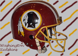
In this activity we were supposed to find a digital image then create a background and add text that were composed of colors found in the original image.
This was the original image that I started with. I took this image and removed the background so there was only the redskins helmet.
This was my first attempt at color echo. The off white background was from the white circle next to the picture of the Indian. The burgundy color of the font was from the helmet. I then tried to create a more intricate background like the example in the book.
I used the paint tool to draw alternating stripes. The burgundy color was from the helmet and the yellow color was from the yellow tip of the feather. Some of the stripes were not completely straight evenly spaced or lined up where they went behind the helmet.
Here the lines are perfect straight and where they go behind the helmet they come out at exactly the right place because I put the stripes on a different layer. I had some problems with the text at first because one of the stripes was the same color as the text and I had to go back and add space between the strip and the text. Some of the stripes are at different angles and do not have uniform space between them. I think since the lines are perfectly straight this makes the gaps and different angles look worse. I like the one with the and drawn lines better. I also like the space between the line and the helmet rather than just the helmet laid over top of the lines.
During this class period we also discussed hue and saturation. I added some images discussing the change in hue and saturation.
This was the original image that I started with.
The first thing I did was to set the hue to -30. This added more blue than the original image contained. The purple places in the ocean turned to dark blue and the red places on the mountains turned more pink.
Most of the green areas on land turned yellow. But, there was still some green places left.
I change the hue again and this time the image looked completely different. None of the colors were in the same area as they were in the original image. The ocean is now green and yellow and the land is light blue, dark blue, purple, and red. Next I put the hue back to the default settings and played around with the saturation.
This is the original image with a little change in the saturation. All of the colors are the same but they are more dull.
Here I set the saturation all of the way down and there are no colors left. Everything is in a gray scale.


No comments:
Post a Comment